“I don’t see the value of getting One as I don’t order that much from Swiggy,” he told me. He orders about fifteen times a month.
This is a case study about the distance between those two sentences, why it exists, what it costs the person who says it, and what you can put on a screen to close it.

In India, almost nobody cooks dinner at 9pm on a Tuesday any more. They open Swiggy. The food has a price, and then the order has a few more charges added on top of it: a delivery fee, a handling fee, and extra when it rains or when everybody orders at the same time.
Each of those charges is small. Thirty rupees, forty, sometimes sixteen. Small enough that you agree to it without really reading it, because you are hungry and you have already decided what you want. And because you never see them together, you never find out what they add up to.
The Product
It is a membership. It costs ₹199 a month. While you have it, Swiggy stops charging you the delivery fee on food orders above ₹99 and on Instamart orders above ₹199, it stops charging surge pricing when demand is high, and it adds its own discounts on top of whatever offers are already running.
So it is not a discount card and it is not a loyalty scheme. It is a switch that turns off a category of charge you are currently paying every time you order.

Target audience
Someone who thinks he barely uses Swiggy.
“I don’t see the value of getting One as I don’t order that much from Swiggy.”
- Swiggy user
Then I asked him how often he actually orders. Four food orders in a month, he said. And then, almost as an afterthought, ten to twelve orders from Instamart.
That is around fifteen orders a month, with a delivery fee on most of them. He is not a light user. He is one of the heaviest users you could design for. He simply has no idea, because nothing in his life has ever asked him to count.
This is the whole project in one conversation. He was not refusing the membership because it was bad value. He was refusing it because he had the wrong picture of himself, and nothing on the screen corrected it.
My Role
Product Designer
Timeline
4 days
Swiggy One is priced by the month. The fees it removes are charged by the order. To work out whether the membership is worth it, you have to convert one into the other, take every fee you paid last month, add them up, and hold that total against ₹199.
Nobody does this. It is arithmetic across thirty days of receipts you have already closed and forgotten. So instead of comparing, people estimate, and the estimate comes from a rough sense of how often they order. As the conversation above shows, that sense can be wrong by a factor of three.
Every subscription I looked at has this same shape, and none of them help. Zomato Gold, Zepto Pass, Amazon Prime and Uber One are all priced per month, and all describe the benefit as a capability or an average. Uber One advertises that “members save $26 on average every month”, which is a fact about a population, not about the person reading it.
People turn down Swiggy One because they cannot see what they already spend.
The membership gets read as a new thing to pay for, sitting alongside the food. It is actually a reduction on something already being paid, every week, in small amounts. Nothing in the app makes that visible before the decision, so the reduction has to be taken on faith and the ₹199 does not.
Swiggy is the only party in this conversation that already knows the answer. Every fee on every past order is in the account.
A receipt user can check
His own recent orders, the fee charged on each one, added up, with ₹0 beside the same list.

Three doors, one argument
A banner in the feed, a modal that interrupts once, and a card under a bill he has just paid.

A prototype in code
Built in HTML and CSS and run in a browser, with real type, real spacing and real tap targets.
Constraints
Some of these came from the product, some I set myself to stop the project sprawling. Writing them down early is what made it possible to throw ideas away quickly later.
The checkout page does not change
Swiggy already sells One in the cart. That surface stays exactly as it is, because if two things improve at once, neither can be credited.
₹199 a month is given
No tiers, no annual plan, no cheaper trial. The price is not the thing being designed.
One is not only a delivery-fee product
It also covers surge, extra discounts, Instamart above ₹199 and Dineout. An argument built only on delivery fees undersells what is being bought.
Only his own data
Every number comes from orders he actually placed. Nothing modelled, nothing projected, nothing invented.
Two guardrails
Order frequency among non-members must not drop, and cancellations in the first thirty days must not rise. Nothing may read as “look how much you spend.”
How I navigated them
Competitor teardowns on MyFitnessPal, Yazio, and N. I mapped IA, logging flows, and friction points from public reviews.
A small number of apps were experimenting with natural language logging. The approach wasn’t widespread, but the logic fit Allerwell, especially the allergy-managing users, where parser-level ingredient work has more value than in a generic tracker.
Internal feedback ran in parallel. A team of 10 to 12 used the app regularly, including 4 from teams unrelated to the product. That gave me at least some signal from people outside the product context.

I ran four rounds. The first two produced fifteen ideas and I deliberately did not try hard on them, because the obvious idea is obvious because it usually works, and sometimes it is the right one.
The useful part was writing the move underneath each idea, the thing it actually does, stated in one line. Two ideas with the same move underneath them are one idea, however different the screens look. Doing that collapsed the pile fast. “A monthly strip”, “a running counter” and “a card on the tracking screen” all turned out to be the same move wearing different clothes.
The final move was to remove the visible nav entirely. The experience collapsed onto a single home screen. Logs, scan history, and profile became sheets accessed from the home screen rather than separate destinations.
The persistent input bar became the single entry point for logging, always visible and always one tap away.
This created functional separation from competitors.
The surviving idea had to live somewhere. I wrote down the cost of each option before choosing.
Its own screen
Room for everything: the orders, the fees, and what One covers beyond delivery. Costs a step, and he arrives hungry. Who never sees it: almost everybody, because nobody navigates to a subscription page on purpose.
A modal
Costs no steps and gets seen. Holds one number and drops everything else, and it is gone the moment he taps the X.
A banner in the feed
Costs no steps and can be scrolled past forever. Carries the number, cannot carry the benefits.
What I chose, and what it cost.
All three, ranked, rather than one. The modal interrupts once so the number gets seen. The banner stays behind after the modal is dismissed, because one dismissible surface would have ended the project for anyone who taps the X. The full screen sits behind both, for anyone who wants to check the arithmetic.
Everything of substance now lives one tap away from a screen nobody visits deliberately. I took that cost because it was the only shape with room to say that One covers more than delivery fees.
Seven surfaces, and the version I kept.
The argument is the same everywhere. His own fees, added up, set against ₹199. What changes is how much room each surface has to make it, and how much of his attention it is entitled to take. Where two versions were close, both are here with the reason one won.
The interruption
The modal is the one surface that does not wait to be found. It appears once per user, carries the receipt and the button in the same breath, and is the one place the evidence-before-price rule gets broken on purpose.
It runs on both tabs, taking the colour of whichever one it lands on, and each tab reads its own order history, because a receipt full of restaurants proves nothing to someone standing in Instamart.
On Food
Purple, over the Food home. The receipt lists five restaurants he ordered from and the fee charged on each, ₹212 in total, then the same list at ₹0.
On Instamart
The same modal in Instamart blue, with the receipt rebuilt from his Instamart history: five baskets by date and item count, ₹204 in fees. The first three are the same orders the blue card behind it is counting.
The interruption
The modal is the one surface that does not wait to be found. It appears once per user, carries the receipt and the button in the same breath, and is the one place the evidence-before-price rule gets broken on purpose.
It runs on both tabs, taking the colour of whichever one it lands on, and each tab reads its own order history, because a receipt full of restaurants proves nothing to someone standing in Instamart.
Purple, over the Food home. The receipt lists five restaurants he ordered from and the fee charged on each, ₹212 in total, then the same list at ₹0.
The same modal in Instamart blue, with the receipt rebuilt from his Instamart history: five baskets by date and item count, ₹204 in fees. The first three are the same orders the blue card behind it is counting.
Allergen layer, scope and behavior
Allergen handling is split across two surfaces, each doing different work.
Menu scan, proactive
The user points the camera at a restaurant menu. The app extracts items and flags any containing ingredients the user has marked as allergens or intolerances.
This is the higher-stakes surface. The user hasn’t eaten yet, and the goal is to catch the problem before they order.

Logging, retroactive
When a logged meal contains a flagged ingredient, it surfaces inline on the meal card. Logging-time flagging does different work than the menu scan.
The parser knows ingredient breakdowns the user often doesn’t. That’s where flagging during logging earns its place.
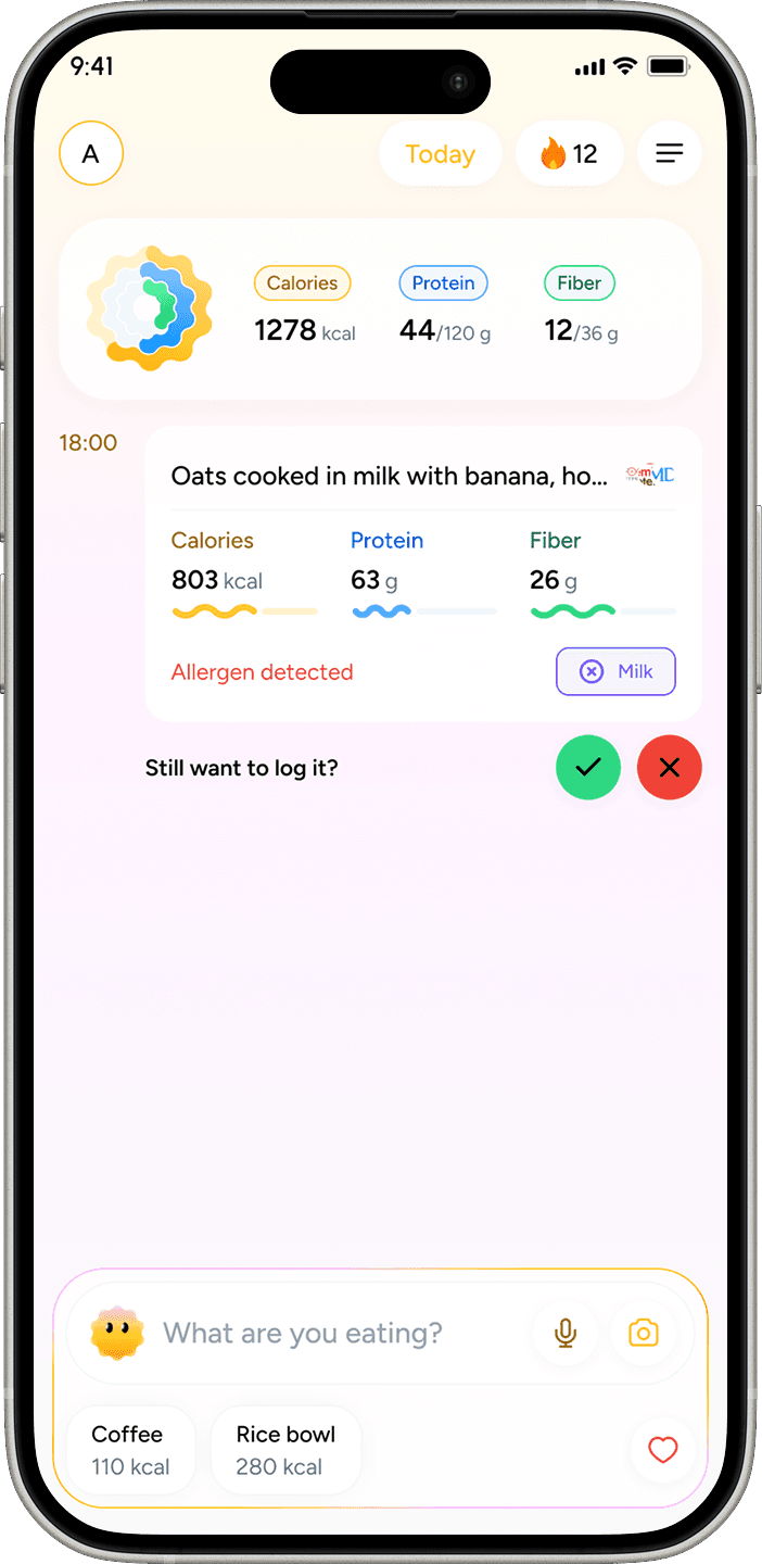
Scope, what allergens are and aren’t
Allerwell flags ingredients. It doesn’t give medical advice, and the UI says so.
A short inline disclaimer in the allergen flow notes that automated detection isn’t a substitute for the user verifying ingredients themselves.
The product’s job is to surface what the parser found and how confident it is. Not to make a clinical call.

What the numbers say
Measured 30 days post-launch against 30 days immediately pre-launch.
+75%
Logs per active user per day.
Average daily logs per active user moved from 2 to 3.5
+12%
Active users
Novelty effect is unmeasured
A 30-day post-launch window can capture a curiosity bump that decays. Day 7 / Day 30 retention curves would tell us whether the +75% held.
I don’t have those curves. The number is a real movement, but I can’t confirm it’s a habit change rather than a launch spike.
The structural shift is the clearest signal. The old design distributed the experience across five equal-weight tabs. The new design has one obvious entry point.
The internal team, when I asked for feedback after launch, didn’t surface the “where do I start” complaint that they’d raised about the original.

Old food log
New food log flow
No retention cohort data
Day 7 and Day 30 retention curves would tell us whether the +75% is a habit change or a launch spike. I don’t have them.
No formal usability testing
Validation is behavioral, not attitudinal. Whether natural language input matches users’ mental models, and where confusion still exists, are questions the current data doesn’t answer.
Removing navigation only works if what replaces it is stronger than what it replaced.
A persistent input bar carries the experience here because logging is genuinely the action users come to the app for. If the core loop were less clear, collapsing the IA this aggressively would have hurt discoverability without a compensating benefit.
Tabs aren’t the problem. Navigation that doesn’t reflect actual usage priority is the problem.
Working without primary user research is a constraint, not a methodology.
Competitor analysis and team feedback filled the gap well enough to ship something that moved the metrics.
They can’t tell you what users are confused by silently. The friction that never turns into a complaint, just a drop-off.

The redesign extended past the app itself.

Logo
The previous identity was wordmark-only. The new mark adds an icon, a form simple enough to work as an app icon and favicon, and expressive enough to carry character.
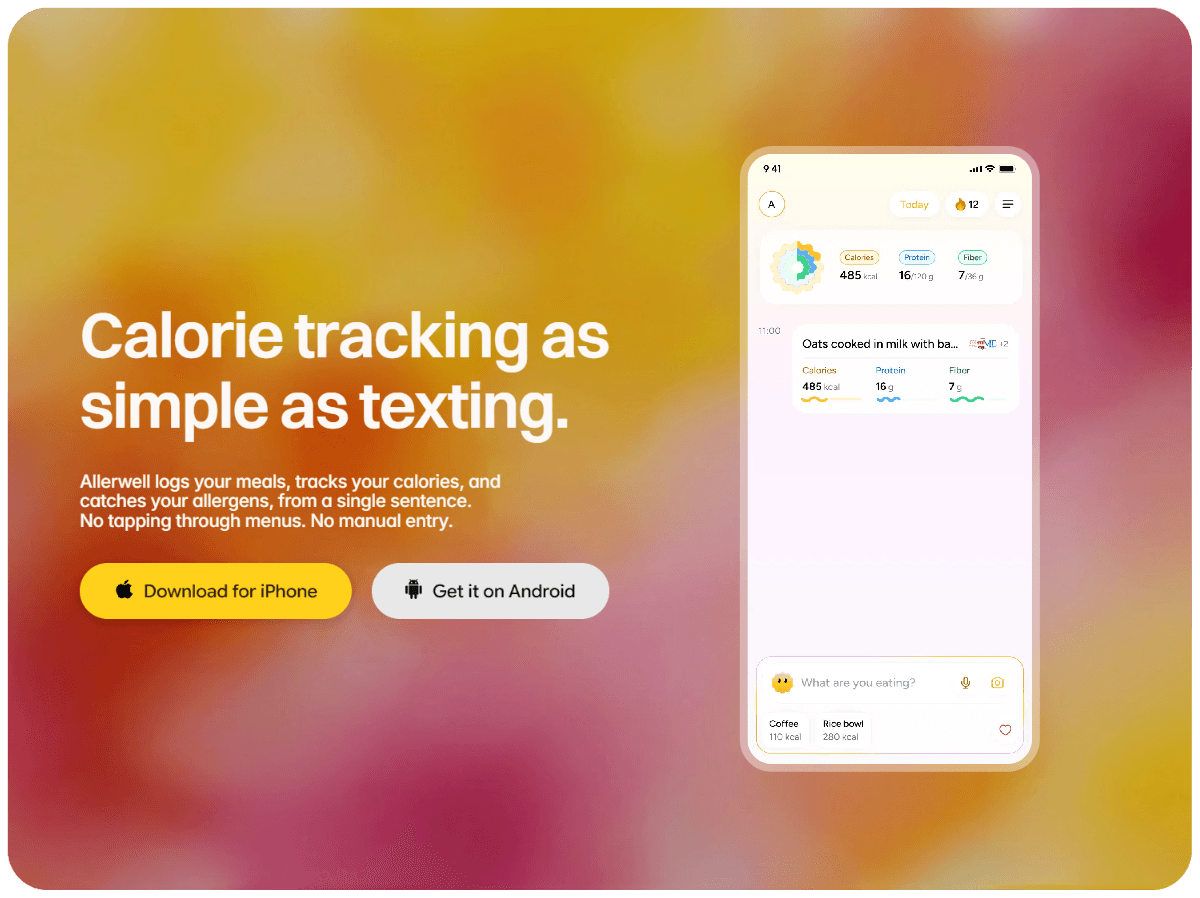
Marketing site:
Designed as a single-purpose surface: explain what Allerwell does and get the user to install. Same visual language as the app.
Meal prep and calendar integration
Both extend logging from “what I ate” toward “what I’m planning to eat.”
Longer term
The natural language model opens the door to a more conversational experience. Worth exploring once the current flows are tighter.