Allerwell is a food logging app that uses natural language input and surfaces allergens in what users eat. This case study walks through the redesign that removed the navigation, why I made that call, and what I learned from shipping it.

Food logging is a daily action that most apps have built for a different shape of life than the one users actually live.
The standard flow is: search a food, pick from near-identical results, adjust portions, confirm, repeat for each item in the meal. It works for a single packaged item. It doesn’t fit the few seconds someone is actually willing to give it while standing in a queue, eating at a desk, or remembering a meal they finished an hour ago.
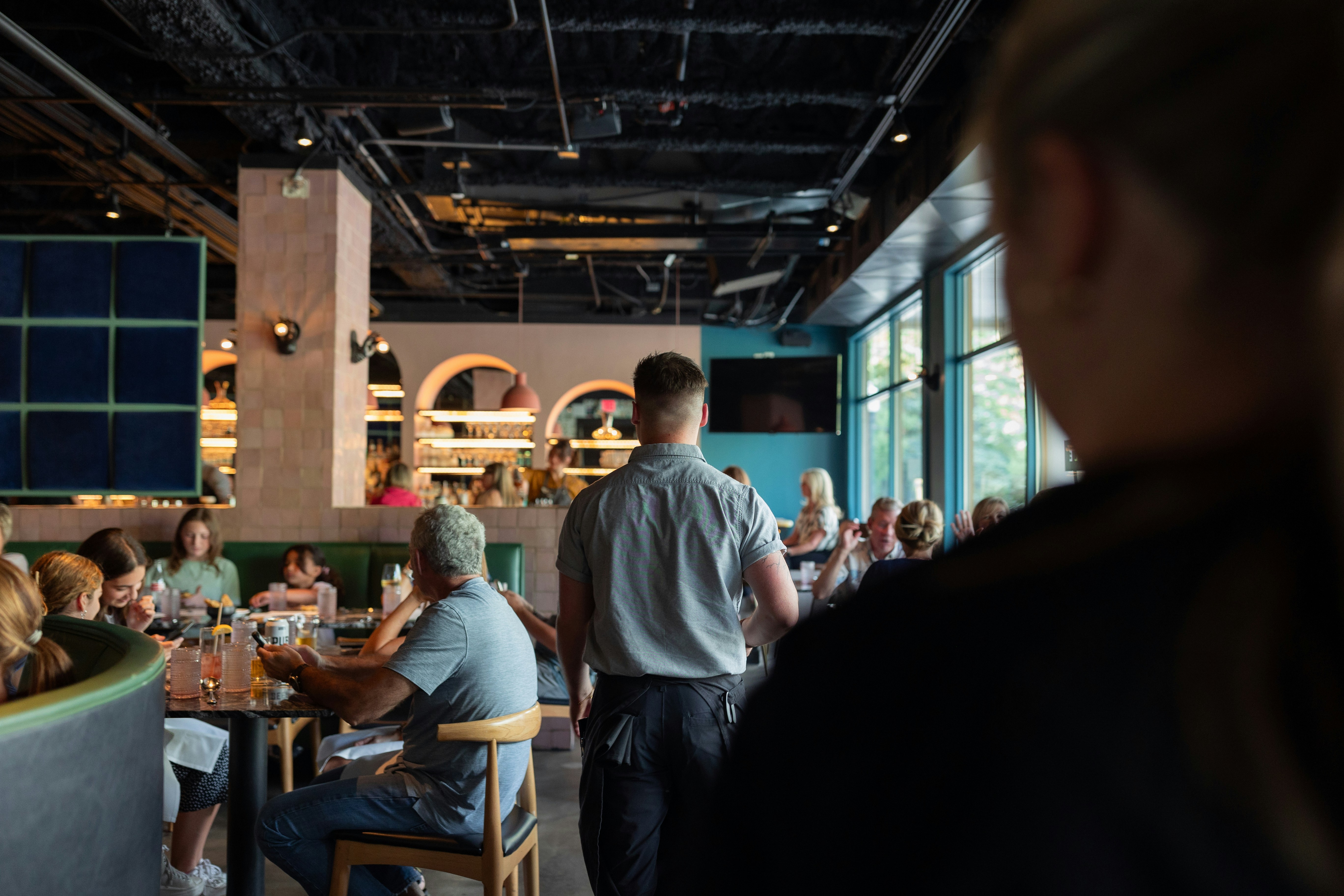
For people managing food allergies, the friction compounds. Restaurant and takeaway food carries ingredients the user often doesn’t know in detail. The app needs to do ingredient-level work the user can’t reliably do themselves, and it needs to do it fast enough to be useful at the moment of decision: before ordering, not after.
Problem
Allerwell logs meals through natural language and surfaces allergens in what the user eats or is about to eat.
The user types or says “I had 50g oats cooked in milk with 1 banana,” and the app returns calories, macros, and any flagged allergens. No assembling the meal item by item.
A separate menu-scan flow flags allergens on restaurant menus before the user orders.
It’s live on the App Store and Play Store. Free for now, which is why active user growth matters as an early-stage signal.

Target audience
Two populations, two slightly different jobs.
Nutrition trackers: Open Allerwell after they’ve eaten to log the meal so they can see calories and macros over time. The job is recording. Speed matters because they’re already moving on to whatever’s next.
Allergy users: Open Allerwell at the point of decision, often at a restaurant or takeaway counter. The job is verification. Speed matters because the decision is time-pressured and the cost of getting it wrong is real.
The wedge is the overlap. Trackers don’t handle allergens at the ingredient level. Allergy apps don’t track nutrition. A meaningful share of Allerwell’s users want both, and don’t want to maintain two separate apps to get them.
The structural diagnostic was easy: the previous version had five tabs of equal weight, and logging was one tab among five.
The deeper problem was that the app’s structure didn’t fit how the action was actually done. Logging is a daily, behavior, not a destination.
Building it as a tab among five treated it like one of several places the user might want to go, when in practice it was where most sessions started and ended.
The redesign used IA as the lever, but the goal was behavioral.

30 days post-launch vs 30 days pre-launch.
+75%
Logs per active user per day.
Average daily logs per active user moved from 2 to 3.5
+12%
Active users
The Pivot
Old 5-tab nav vs new single home screen. (The structural decision)

Loading State
Empty input to skeleton card to filled result. (Designing for AI ambiguity)
Allergen Flag
Inline allergen surfacing on a logged meal. (The allergen layer)

Constraints
Two real ones: no primary user research, and a single designer across the entire product. The three engineers were collaborators on the technical-design questions, not on UX.
Decisions had to be grounded in something other than user interviews.
How I navigated them
Competitor teardowns on MyFitnessPal, Yazio, and N. I mapped IA, logging flows, and friction points from public reviews.
A small number of apps were experimenting with natural language logging. The approach wasn’t widespread, but the logic fit Allerwell, especially the allergy-managing users, where parser-level ingredient work has more value than in a generic tracker.
Internal feedback ran in parallel. A team of 10 to 12 used the app regularly, including 4 from teams unrelated to the product. That gave me at least some signal from people outside the product context.


The 5-tab nav was the structural symptom. Equal visual weight across five destinations, no single action primary. The action that mattered most, logging, was buried by parity.
I tried one alternative before committing: a 3-item nav with a prominent input bar at the bottom. The internal team compared it to the no-nav version. The feedback was opinion-based, not behavioral. I didn’t observe what they tapped first, where they got stuck, or whether the input bar self-explained without onboarding. I collected preferences.
Based on those preferences, I went with the no-nav direction.

The final move was to remove the visible nav entirely. The experience collapsed onto a single home screen. Logs, scan history, and profile became sheets accessed from the home screen rather than separate destinations.
The persistent input bar became the single entry point for logging, always visible and always one tap away.
This created functional separation from competitors.
Removing the visible nav meant accepting a discoverability hit on secondary features: scan history, profile, detailed stats.
The bet was that the core loop was strong enough to keep users in the app long enough to find the rest. Post-launch numbers moved in the right direction.
Natural language input introduces ambiguity that structured search doesn’t have. That’s a deliberate trade.
Step 1: You type

Step 2: Allerwell parses

Step 3: Instant results

Designing for AI ambiguity
Natural language logging shifts complexity from the user to the system.
The user types a sentence. An LLM-based parser breaks it into ingredients, infers quantities, returns macros, and flags allergens. The result has to land fast enough that the interaction still feels like logging, not waiting.
That work is invisible when it goes well and very visible when it doesn’t. Most of the design work after the IA pivot went into making the invisible work feel reliable.
Loading state
Not a spinner. A skeleton of the meal card.
The skeleton has the same shape and layout as the final result, with placeholder blocks where each piece of data will appear.
The result fills in progressively in this order:
1. The user’s input, echoed back so they can see what the parser is working with
2. Allergens, if any are flagged
3. Macros: calories, protein, carbs, fats
4. Sources: the food databases and references
The order isn’t arbitrary. Echoing the input first confirms the parser heard the user correctly, before it commits to any conclusions. Allergens land second because for the allergy-managing user, that’s the answer they came for; the macros are secondary.
A general nutrition tracker would surface macros first. Allerwell doesn’t, because the wedge is the allergen layer.

A natural language input bar self-explains less than a search field does. A new user who opens the app has no schema for what to type.
Two pieces handle the cold-start surface.

Rolling placeholder text in the input bar
The placeholder cycles through example prompts (“What did you eat?” / “Try: 2 eggs and toast”) For the user to see.

Empty home screen
It's for new users surfaces a suggested prompt the user can tap to log. The first log isn’t a blank field, it’s a one-tap action.
Confidence signaling
The parser doesn’t always get it right. The UI doesn’t pretend it does.
When confidence on an ingredient or quantity is below threshold, the meal card shows a low-confidence label and prompts the user to verify.
The system biases toward flagging when uncertain. A “possible” allergen is shown rather than hidden. A short inline disclaimer notes that automated detection isn’t a substitute for checking.

Voice Input
Voice is a primary path, not a fallback. The mic icon lives inside the input bar next to the camera icon for menu scan, both inputs treated as peers of typing rather than buried behind a separate flow.
The voice flow shows the transcript before parsing, not after.
The user sees what the speech-to-text heard (“shakshuka,” “pho”) and can correct it before the parser commits, which matters for the long tail of dish names that speech-to-text mangles.
Offline behavior
With no connection, the app queues the entry locally and shows an offline indicator on the card.
The queue processes automatically when the network returns. The user doesn’t lose the log, and they don’t have to remember to retry.

Allergen layer, scope and behavior
Allergen handling is split across two surfaces, each doing different work.
Menu scan, proactive
The user points the camera at a restaurant menu. The app extracts items and flags any containing ingredients the user has marked as allergens or intolerances.
This is the higher-stakes surface. The user hasn’t eaten yet, and the goal is to catch the problem before they order.
Logging, retroactive
When a logged meal contains a flagged ingredient, it surfaces inline on the meal card. Logging-time flagging does different work than the menu scan.
The parser knows ingredient breakdowns the user often doesn’t. That’s where flagging during logging earns its place.
Scope, what allergens are and aren’t
Allerwell flags ingredients. It doesn’t give medical advice, and the UI says so.
A short inline disclaimer in the allergen flow notes that automated detection isn’t a substitute for the user verifying ingredients themselves.
The product’s job is to surface what the parser found and how confident it is. Not to make a clinical call.
What the numbers say
Measured 30 days post-launch against 30 days immediately pre-launch.
+75%
Logs per active user per day.
Average daily logs per active user moved from 2 to 3.5
+12%
Active users
Novelty effect is unmeasured
A 30-day post-launch window can capture a curiosity bump that decays. Day 7 / Day 30 retention curves would tell us whether the +75% held.
I don’t have those curves. The number is a real movement, but I can’t confirm it’s a habit change rather than a launch spike.
The structural shift is the clearest signal. The old design distributed the experience across five equal-weight tabs. The new design has one obvious entry point.
The internal team, when I asked for feedback after launch, didn’t surface the “where do I start” complaint that they’d raised about the original.

Old food log
New food log flow
No retention cohort data
Day 7 and Day 30 retention curves would tell us whether the +75% is a habit change or a launch spike. I don’t have them.
No formal usability testing
Validation is behavioral, not attitudinal. Whether natural language input matches users’ mental models, and where confusion still exists, are questions the current data doesn’t answer.
Removing navigation only works if what replaces it is stronger than what it replaced.
A persistent input bar carries the experience here because logging is genuinely the action users come to the app for. If the core loop were less clear, collapsing the IA this aggressively would have hurt discoverability without a compensating benefit.
Tabs aren’t the problem. Navigation that doesn’t reflect actual usage priority is the problem.
Working without primary user research is a constraint, not a methodology.
Competitor analysis and team feedback filled the gap well enough to ship something that moved the metrics.
They can’t tell you what users are confused by silently. The friction that never turns into a complaint, just a drop-off.

The redesign extended past the app itself.

Logo
The previous identity was wordmark-only. The new mark adds an icon, a form simple enough to work as an app icon and favicon, and expressive enough to carry character.

Marketing site:
Designed as a single-purpose surface: explain what Allerwell does and get the user to install. Same visual language as the app.
Meal prep and calendar integration
Both extend logging from “what I ate” toward “what I’m planning to eat.”
Longer term
The natural language model opens the door to a more conversational experience. Worth exploring once the current flows are tighter.